A warm and inclusive identity for a European consulting firm.
Overview
A contemporary identity for a European consulting firm focused on inclusion and team culture.
Brand Concept
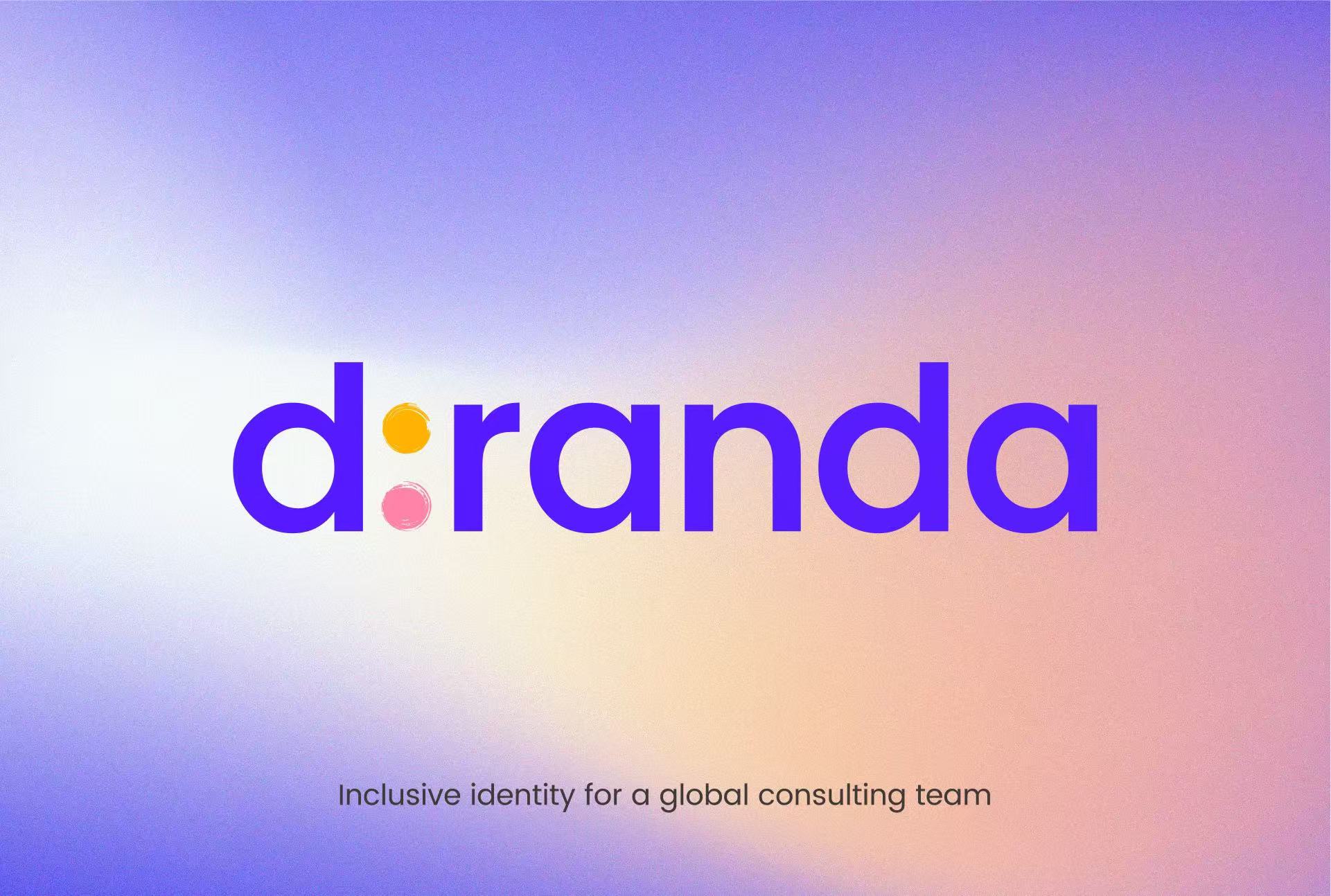
Diranda is a European consulting firm specialising in organizational inclusion and team culture. The brand aims to create a sense of positivity, ease and welcome, a feeling of being seen and accepted. The identity is built around two coloured dots representing diversity, inclusion and connection.
Logo System
A flexible system including primary, monochrome and compact variations for seamless use across print and digital environments.
Logo Rationale
The colon replacing the letter “i” introduces a deliberate pause, a moment before dialogue begins: to see, to listen, to understand.
It reinforces the brand’s commitment to meaningful connection and inclusive leadership.
Colour System
A warm and modern palette built around the three core dots, expressing openness, diversity and connection. The colours remain clear and accessible across digital and print applications.
Typography
Poppins was chosen for its geometric clarity and approachable tone, balancing professionalism with human warmth, central to Diranda’s brand personality.
Applications
The identity extends across stationery, digital interfaces and presentation materials, maintaining a consistent sense of clarity, optimism and approachability throughout every touchpoint.