Brand Identity Design – A Singaporean company specializing in the production of a wide range of local foods,
Momo’s brand identity showcases its signature product through a unique logo design that blends hand-drawn typography of the brand name with a bitten piece of mochi.
The packaging design for Momo’s mochi products is brought to life through hand-drawn illustrations and color-matching, creating three distinctive flavors.
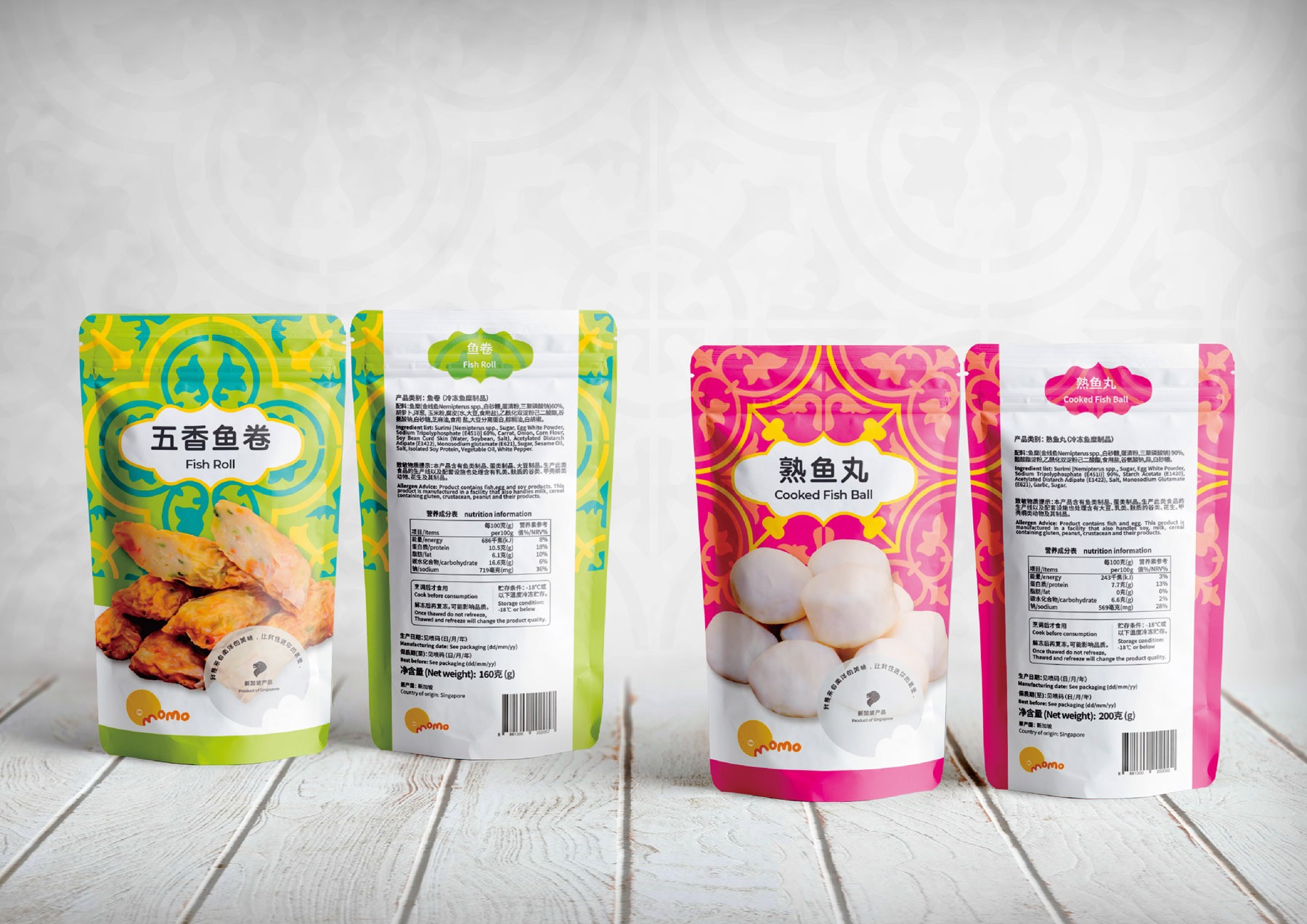
The packaging for Momo’s fish ball series is inspired by traditional Peranakan tiles, with two tile patterns and conventional Peranakan colors used to create a visually appealing design that evokes nostalgia and promotes Southeast Asian culture. (Designed to reflect the traditional and colorful heritage of the region)